
October 2026 · Pavel
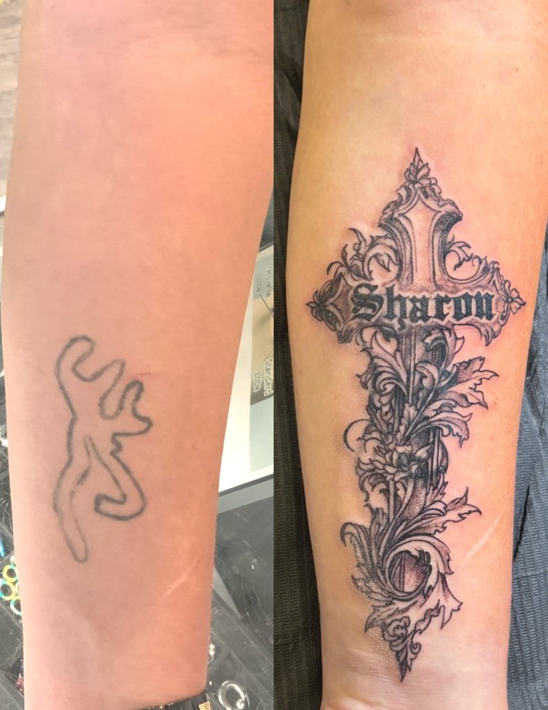
Not every tattoo arrives at the studio as an idea. Some arrive as a problem. This one came in as a Browning logo, the classic deer-and-crosshairs hunting mark in solid black, small and permanent. A piece from another chapter of his life that had quietly stopped meaning anything. He did not want a touch-up. He wanted it gone without laser sessions, and something he would be proud to wear standing in its place.
People underestimate logo cover-ups because the old piece looks small. The problem is not the size. It is the density. A Browning mark is a solid silhouette with hard printed edges: pure black, no gradient, no skin left inside the outline. Whatever goes on top has to be darker in that exact spot, or the old logo ghosts through the new work for life.
That constraint drives the whole design. The new piece needs solid black exactly where the old logo sits, with enough weight around it that the coverage never reads as a patch. Then the search is not for any design, but for the right design that happens to be dark in the right places. Some of the most powerful motifs in tattooing are exactly that.
We talked about what he wanted the skin to say instead. The answer came down to faith and family, and it had a name: Sharon. The design became an ornate gothic cross with thick dark beams, Sharon set across it in Old English lettering, and foliage woven around the edges so the composition breathes.
A name in Old English is not decoration here. It is the weight the whole piece hangs on. And lettering that bold is perfect cover-up material: those thick strokes are fields of black you can place deliberately, like bricks, right on top of the old mark.
On the stencil, the vertical beam landed over the Browning logo, and the ornament around it was mapped so every edge of the old mark met a new dark shape. Nothing was left to luck: every square centimeter of the old tattoo had somewhere to hide before the machine touched skin.
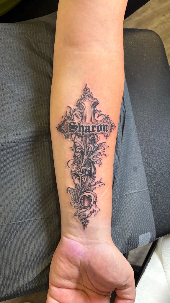
Cover-ups are built in passes. First the outline of the cross and the lettering, locked clean. Then the packing: solid black worked into the beams and the zones mapped over the old logo until the old edges disappeared into new shadow. The foliage came last, in softer grays, so the eye travels from the dense center out to the lighter edges and never asks what used to be there.
Bold pieces always look darker on the day of the session than they will a month later, and this one healed exactly as planned: the cross reads as one confident, intentional tattoo.
A cover-up is a negotiation with physics, not an eraser. The new design must be darker where the old tattoo is darkest, which is why gothic crosses, blackwork and bold lettering are the natural candidates. If you come in hoping to bury a black logo under a fine-line hummingbird in pale gray, I will tell you honestly that it will not hold. The old piece limits your palette. It never limits your meaning.
The photos tell it better than words: the lone logo on bare skin, the new cross rising over it, one finished piece. A successful cover-up is not measured by whether the old tattoo is technically in there somewhere. It is measured by whether anyone looking at the finished piece would ever think to ask.
If you are wearing a piece you have stopped believing in, the first step costs nothing: send a clear photo of the tattoo and the area, and I will tell you honestly what is possible. Transformations like this are exactly the kind of work I take on with intention, here at Inktention Tattoo in downtown Gainesville.
Book your appointment or send me a message with your idea. Custom work, done with intention.